Widget Reference
Settings (v0.2.2)
For each widget, the canonical TOML examples come from repos/settings/demo/schema.toml, a test schema covering every widget.
Overview
widget | Purpose | Key options |
|---|---|---|
text_input | Single-line text | min_width / max_width |
secret_input | Masked input (with a reveal toggle icon) | — |
multiline | Multi-line text | rows |
checkbox | Checkbox | bool. sublabel |
toggle | Toggle switch | bool. sublabel |
select | Dropdown | options / options_from. option_states |
segmented_control | Segmented selector | Same as above. max_width |
exclusive_radio | Mode switch + child widget | Requires an exclusive table |
hotkey | Shortcut recorder | — |
slider | Slider | min / max / step / suffix |
drag_value | Draggable numeric input | Same as above |
separator | Divider line | key / label / type not needed |
file_path | Path input + browse button | is_directory / file_filter / file_extensions |
color_picker | Color picker | Value is #rrggbb |
key_value_map | Key-value table of strings | key_label / value_label |
Text
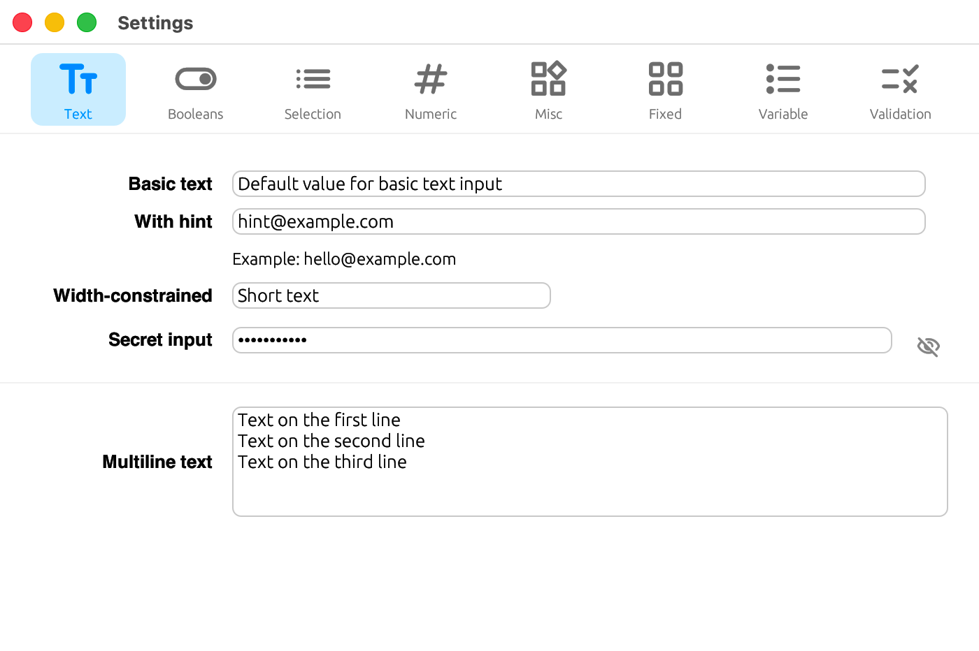
text_input
A single-line text input. Use min_width / max_width to adjust its width.
[[tabs.fields]]
key       = "text.constrained"
label     = { en = "Width-constrained", ja = "幅制限付き" }
type      = "string"
widget    = "text_input"
max_width = 220
secret_input
A masked input field with an icon to toggle visibility.
[[tabs.fields]]
key    = "text.password"
label  = { en = "Secret input", ja = "シークレット入力" }
type   = "string"
widget = "secret_input"
multiline
A multi-line text input. Use rows to set the number of visible lines.
[[tabs.fields]]
key    = "text.notes"
label  = { en = "Multiline text", ja = "複数行テキスト" }
type   = "string"
widget = "multiline"
rows   = 5
Booleans
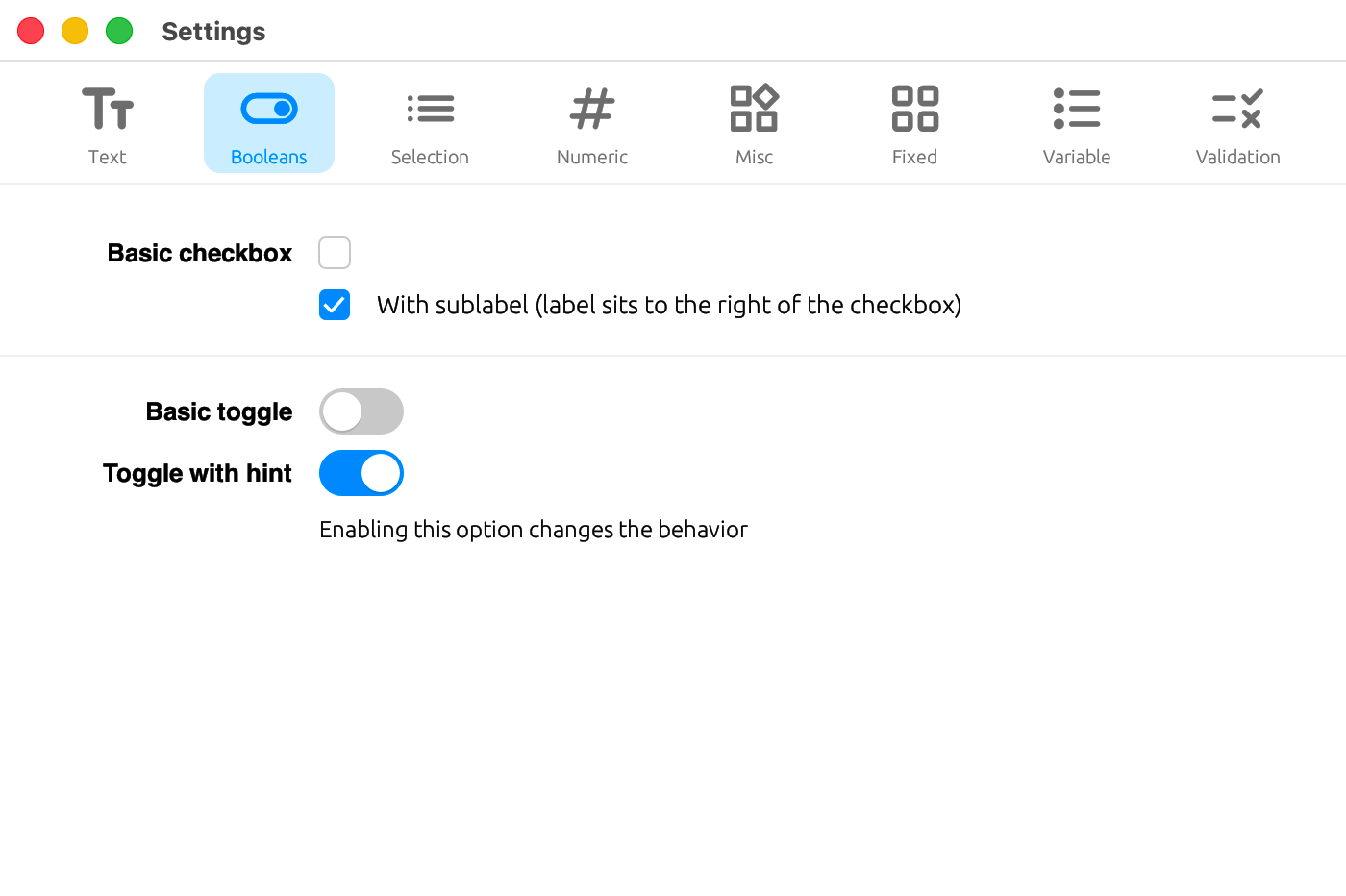
checkbox
A checkbox. When sublabel is given, the label is placed to the right of the checkbox.
[[tabs.fields]]
key      = "booleans.check_sublabel"
label    = ""
type     = "bool"
widget   = "checkbox"
sublabel = { en = "With sublabel (label sits to the right of the checkbox)", ja = "サブラベル付き(ラベルがチェックボックスの右に配置される)" }
toggle
A toggle switch.
[[tabs.fields]]
key    = "booleans.toggle_hint"
label  = { en = "Toggle with hint", ja = "ヒント付きトグル" }
type   = "bool"
widget = "toggle"
hint   = { en = "Enabling this option changes the behavior", ja = "このオプションを有効にすると挙動が変わります" }
Selection
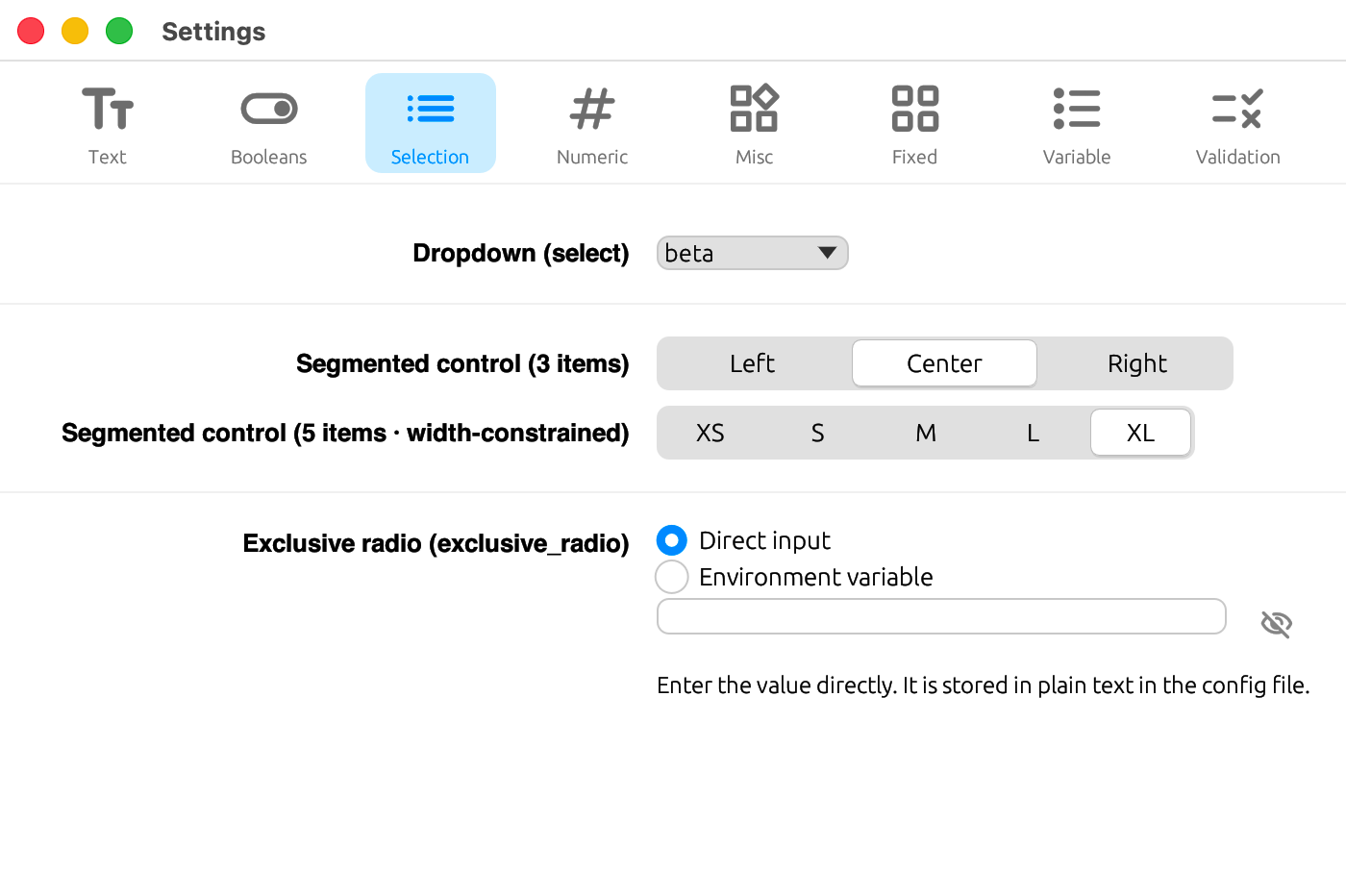
select
A dropdown. Specify the choices via options (a static array) or options_from (generated dynamically from a section_map's key list). Individual options can be disabled with option_states (see Validation).
[[tabs.fields]]
key     = "selection.dropdown"
label   = { en = "Dropdown (select)", ja = "ドロップダウン(select)" }
type    = "string"
widget  = "select"
options = ["alpha", "beta", "gamma", "delta"]
segmented_control
A segmented selector. Options work the same way as select (options / options_from / option_states), and max_width additionally constrains the overall width.
[[tabs.fields]]
key       = "selection.segment5"
label     = { en = "Segmented control (5 items · width-constrained)", ja = "セグメンテッドコントロール(5 項目 · 幅制限)" }
type      = "string"
widget    = "segmented_control"
options   = ["XS", "S", "M", "L", "XL"]
max_width = 280
For the behavior when type = "number" is given, see below.
exclusive_radio
A widget that switches between modes, showing a different child widget for each variant. An exclusive table is required. See the full example below.
Numeric
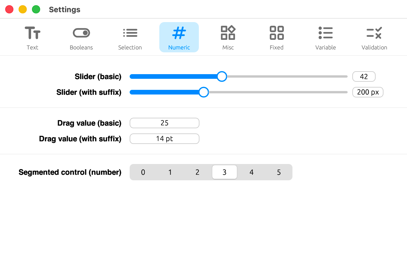
slider
A slider. Use min / max / step to set the range and increment, and suffix for the displayed unit.
[[tabs.fields]]
key    = "numeric.slider_suffix"
label  = { en = "Slider (with suffix)", ja = "スライダー(接尾辞付き)" }
type   = "number"
widget = "slider"
min    = 100
max    = 400
step   = 10
suffix = " px"
drag_value
An input for increasing or decreasing a number by dragging. Its options work the same way as slider.
[[tabs.fields]]
key       = "numeric.drag_suffix"
label     = { en = "Drag value (with suffix)", ja = "ドラッグ値(接尾辞付き)" }
type      = "number"
widget    = "drag_value"
min       = 5
max       = 72
step      = 0.5
suffix    = " pt"
max_width = 120
Layout
separator
A divider line. key / label / type are not needed.
[[tabs.fields]]
widget = "separator"
Misc
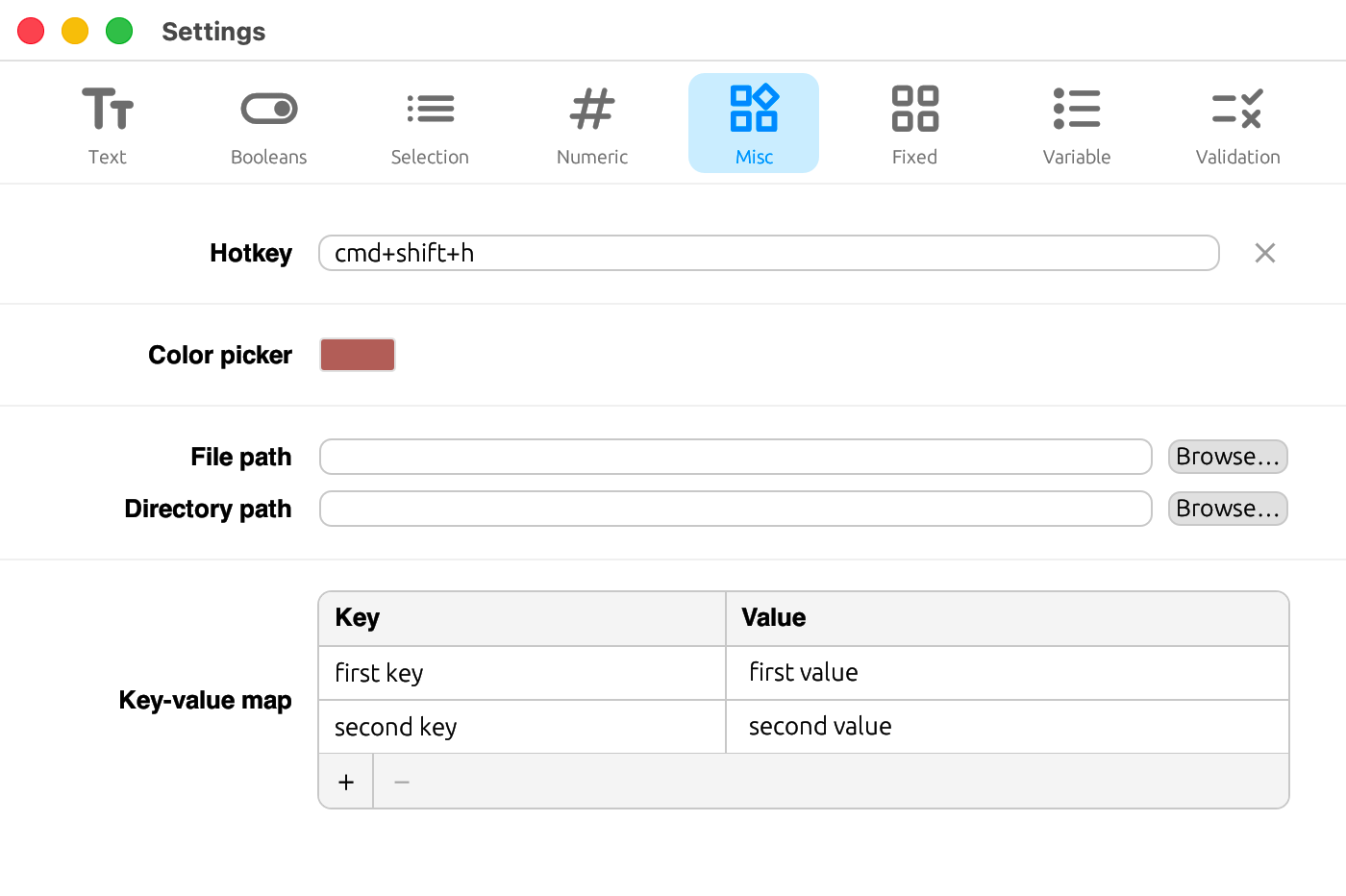
hotkey
A widget for recording keyboard shortcuts.
[[tabs.fields]]
key    = "misc.hotkey"
label  = { en = "Hotkey", ja = "ホットキー" }
type   = "string"
widget = "hotkey"
color_picker
A color picker widget. Values are stored in #rrggbb format (no alpha channel).
[[tabs.fields]]
key    = "misc.color"
label  = { en = "Color picker", ja = "カラーピッカー" }
type   = "string"
widget = "color_picker"
file_path
A path input combined with a browse button. Set is_directory = true to select a directory, and use file_filter / file_extensions to narrow down the file types.
[[tabs.fields]]
key             = "misc.file"
label           = { en = "File path", ja = "ファイルパス" }
type            = "string"
widget          = "file_path"
file_filter     = { en = "TOML files", ja = "TOML ファイル" }
file_extensions = ["toml", "txt"]

[[tabs.fields]]
key          = "misc.directory"
label        = { en = "Directory path", ja = "ディレクトリパス" }
type         = "string"
widget       = "file_path"
is_directory = true
key_value_map
A widget for editing a table of string keys and values. Use key_label / value_label to set the column headers.
[[tabs.fields]]
key         = "misc.kv_map"
label       = { en = "Key-value map", ja = "キーと値のマップ" }
type        = "string"
widget      = "key_value_map"
key_label   = { en = "Key", ja = "キー" }
value_label = { en = "Value", ja = "値" }
segmented_control and type
By default, segmented_control reads and writes string values (type omitted, or type = "string"). Setting type = "number" stores it as a TOML number instead. In that case, options are numeric strings that double as both the labels and the stored values, and whether each is written as an integer or a float depends on whether the option string contains a . (see the codebase for details).
[[tabs.fields]]
key       = "numeric.segment_count"
label     = { en = "Segmented control (number)", ja = "セグメンテッド(数値)" }
type      = "number"
widget    = "segmented_control"
options   = ["0", "1", "2", "3", "4", "5"]
max_width = 280
exclusive_radio example
Use this when you want to switch between different child widgets depending on a mode — for example, "enter the API key directly, or specify it via an environment variable name."
[[tabs.fields]]
key    = "api_key"
widget = "exclusive_radio"
hint_direct = "Stored in plain text in the config file."
hint_env    = "Specify an environment variable name."

[tabs.fields.exclusive]
mode_key     = "api_key_mode"
mode_default = "direct"
variants = [
  { value = "direct", label = { en = "Direct", ja = "直接" }, field_key = "api_key", widget = "secret_input" },
  { value = "env",    label = { en = "Env var", ja = "環境変数" }, field_key = "api_key_env", widget = "text_input" },
]| Field | Description |
|---|---|
mode_key | Config key that stores the currently selected variant |
mode_default | Default value used when no variant is set |
variants | Array of variants. Each entry has value (the stored value), label (display name, localizable), field_key (key the value is stored under), and widget (the child widget kind) |
hint_direct / hint_env | Per-variant helper text (specified on the field) |
The key belonging to whichever variant is not currently selected is removed from the config file.