

Appearance Switch
Appearance Switch is a Bric that lets visitors switch a site built with Blocs 6 for Mac between light and dark appearance. Place it in the Content Area of a stock Blocs Nav Bar or a Minimalist Library Navigation bloc. The switch shows a sun in light mode and a moon in dark mode.
If you use Navbar Pro, use only its built-in Appearance Slider to switch appearance.
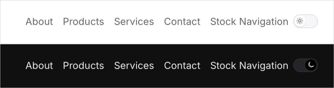
Figure 1. The stock Nav Bar in Blocs Preview. Light mode is on top and dark mode is below. Dark theme classes update the navigation background and link colors.
Install Appearance Switch
Copy the Appearance Switch folder to ~/Library/Application Support/Blocs 6/brics/. Restart Blocs and search for Appearance Switch in the Bric Bar.
Add the switch to your navigation
Stock Blocs Nav Bar
- Select the stock Nav Bar on the canvas or in the layer tree.
- In the right sidebar, turn on
Include Content AreaunderSettings. - Click the empty column that appears in the navigation. Choose
Appearance Switchfrom the Bric Bar.
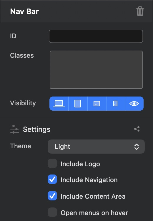
Figure 2. Turning on Include Content Area adds a column to the Nav Bar where you can place the Bric.
Minimalist Library Navigation
- In a project based on the Minimalist Library template, add a bloc from the
Navigationcategory in the Bloc Bar. See the official Minimalist Library guide for template setup. - Select the Nav Bar inside the Navigation bloc and check that
Include Content Areais on. - Place
Appearance Switchin the Content Area column. For example, inNavigation - 1you can replace theGet Startedbutton with the switch.
To share the same navigation across the site, place the navigation bloc in the top Global Area. Use one switch per page.
Set the switch size
Select Appearance Switch and set Size under Appearance in the right sidebar. The value sets the switch height and ranges from 16 to 64 px. The default height is 22 px, which gives a width of 40 px. The width adjusts as you change the height.
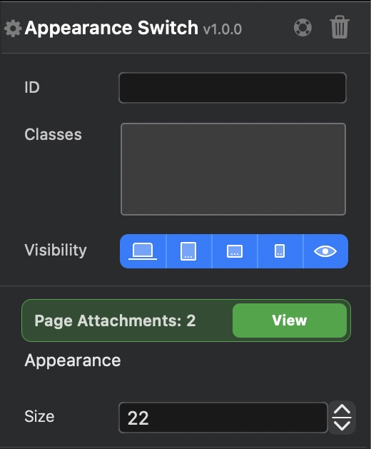
Figure 3. The default Size is 22 px.
Check the switch in Preview
Open Preview in Blocs and press the switch to check its icon and the site's colors. Use the design canvas to adjust the position and size. Test the switch in Preview or on an exported page.
Check whether the switch is visible at mobile widths. In the stock Nav Bar in Figure 4, it sits next to the hamburger menu. In Minimalist Library 3.2, the Content Area of Navigation - 1 is hidden at SM and XS by default. To show the switch at those widths, select its column, enable Visibility at the relevant breakpoints, and check the preview.

Figure 4. The stock Nav Bar at a viewport width of 393 px.
How the appearance choice is saved
On a first visit, the site follows the device's appearance setting. When a visitor switches to an appearance that differs from the device setting, the browser saves that choice. The choice persists on reload and carries over to other pages on the same site that use Appearance Switch. Choosing the appearance that matches the device returns the switch to automatic mode, which follows later changes to the device setting.
The Bric stores auto, light, or dark in localStorage under the key appearance-switch. The setting is shared within one origin, which means the protocol, host, and port all match. To check persistence before publishing, serve the exported page locally, switch its appearance in a browser, and reload it.
Set up dark colors for the site
In dark mode, the switch adds the dark-theme class to body. To set a dark background for a Nav Bar, for example, assign site-nav to the element that has the background. In Class Manager, set the regular background color and use .dark-theme .site-nav for the dark background color. Check the links, body text, and logo in both modes. Blocs Dark Theme guide
The switch also sets data-bs-theme and the CSS color-scheme on html to light or dark. Bootstrap 5.3 components that use its color variables follow the theme. For elements with fixed colors in Blocs, add dark styles where you want those colors to change.
Tested with
Appearance Switch 1.0.0 was tested in Blocs 6.4.8 for Mac with the stock Nav Bar and Minimalist Library 3.2's Navigation - 1. Placement and switching were checked in Blocs Preview. The exported pages were served locally and checked in Chrome for persistence after reload, sharing between pages on the same origin, and following changes in the device's appearance setting.